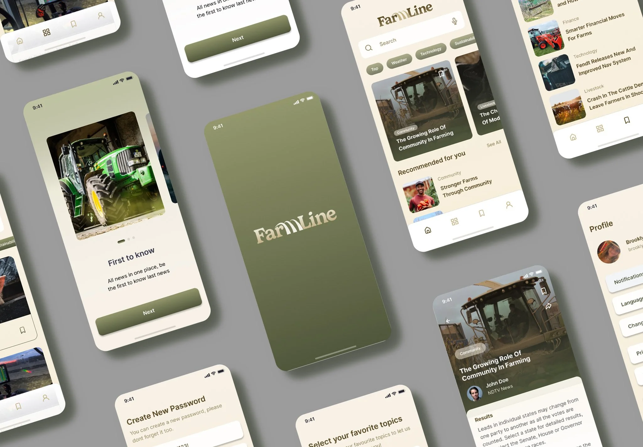
Overview
Farmline Magazine is a mobile app concept that brings farming knowledge, industry insights, and community interaction into one easy-to-use platform. The goal was to improve content discovery and create a more enjoyable reading experience.
Problem
Users struggle to find reliable farming content due to cluttered navigation and information being spread across multiple platforms. This makes it time-consuming and frustrating to access what they need, especially when combined with confusing subscriptions and a lack of personalized content.
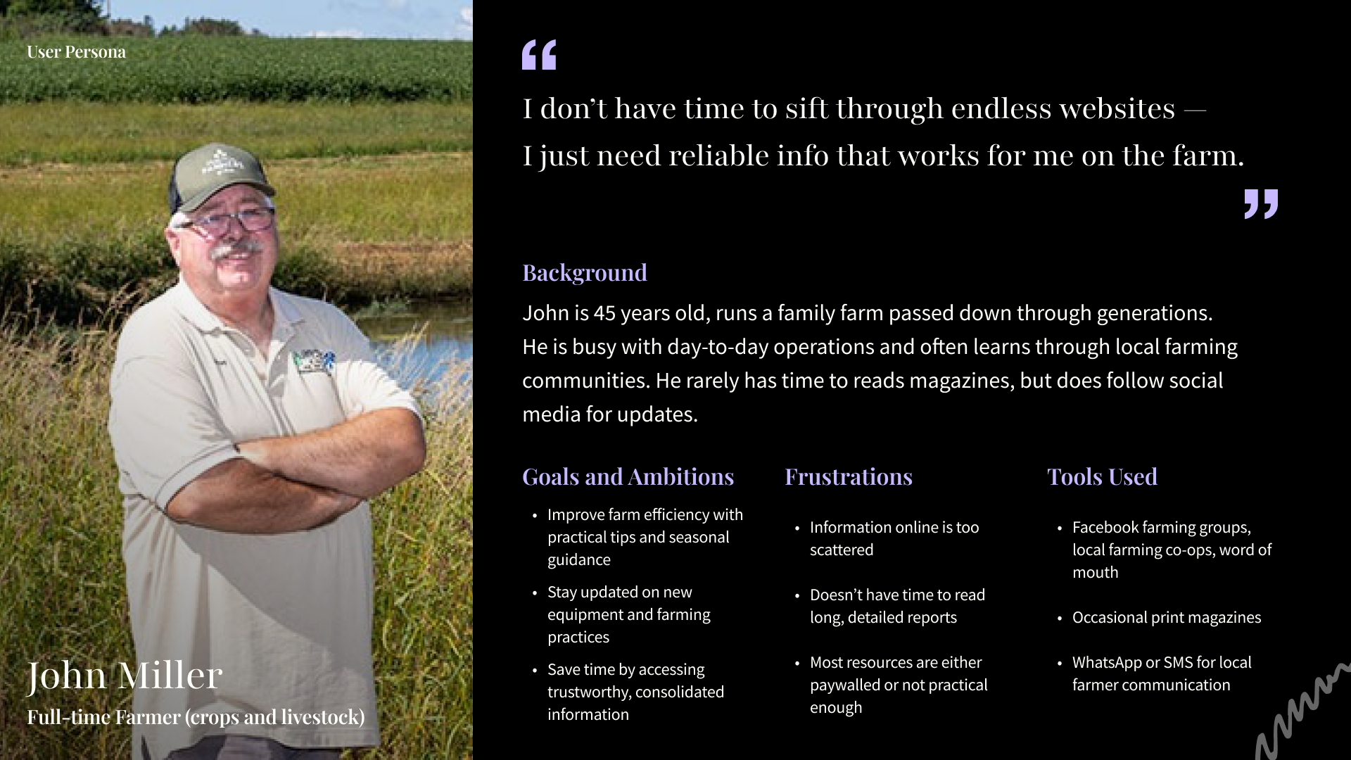
User Research
I conducted interviews to understand how users interact with magazine and farming content. I found that many people struggle with cluttered navigation, too much information, and using multiple platforms to find what they need. Users expressed a desire for a simpler experience with personalized content, easy bookmarking, and offline access. These insights guided the design toward a more clean, intuitive, and user-friendly solution.
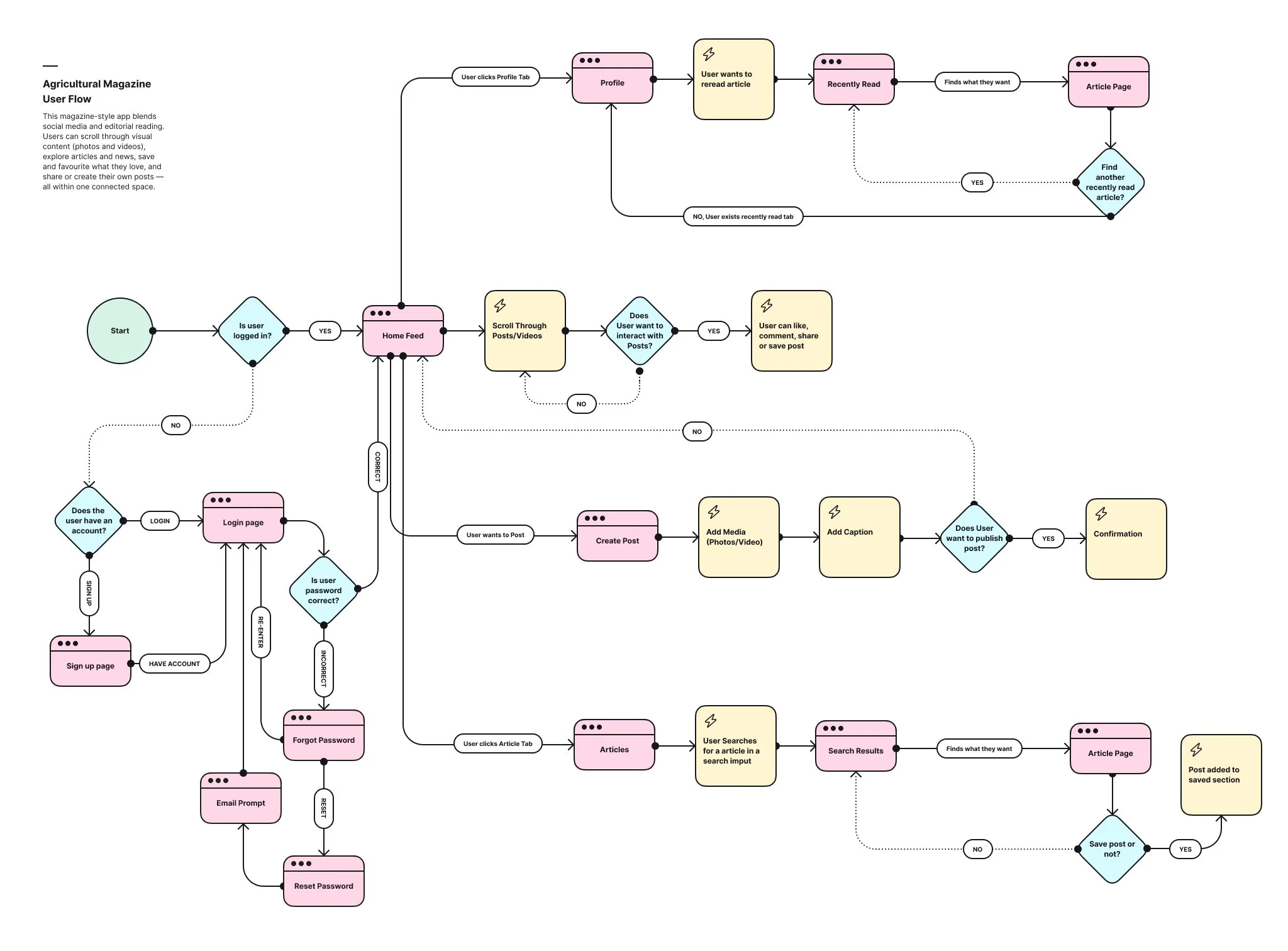
User Flow
The user flow was designed to be simple and intuitive, allowing users to quickly find and engage with content. Users can easily browse a personalized home feed, search or explore categories, and select articles to read. From there, they can bookmark content, interact with posts, or continue exploring without disruption. The flow focuses on minimizing steps and creating a smooth, efficient experience.
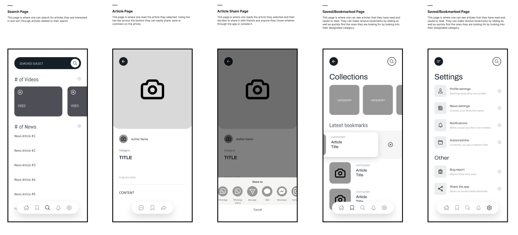
Wireframes
Wireframes were created in Figma to map out the app’s layout and user experience. The focus was on building a clear and simple structure, prioritizing easy navigation and content readability. Key screens such as the home feed, article page, and search were designed in low-fidelity first, allowing for quick adjustments before moving into the final design.
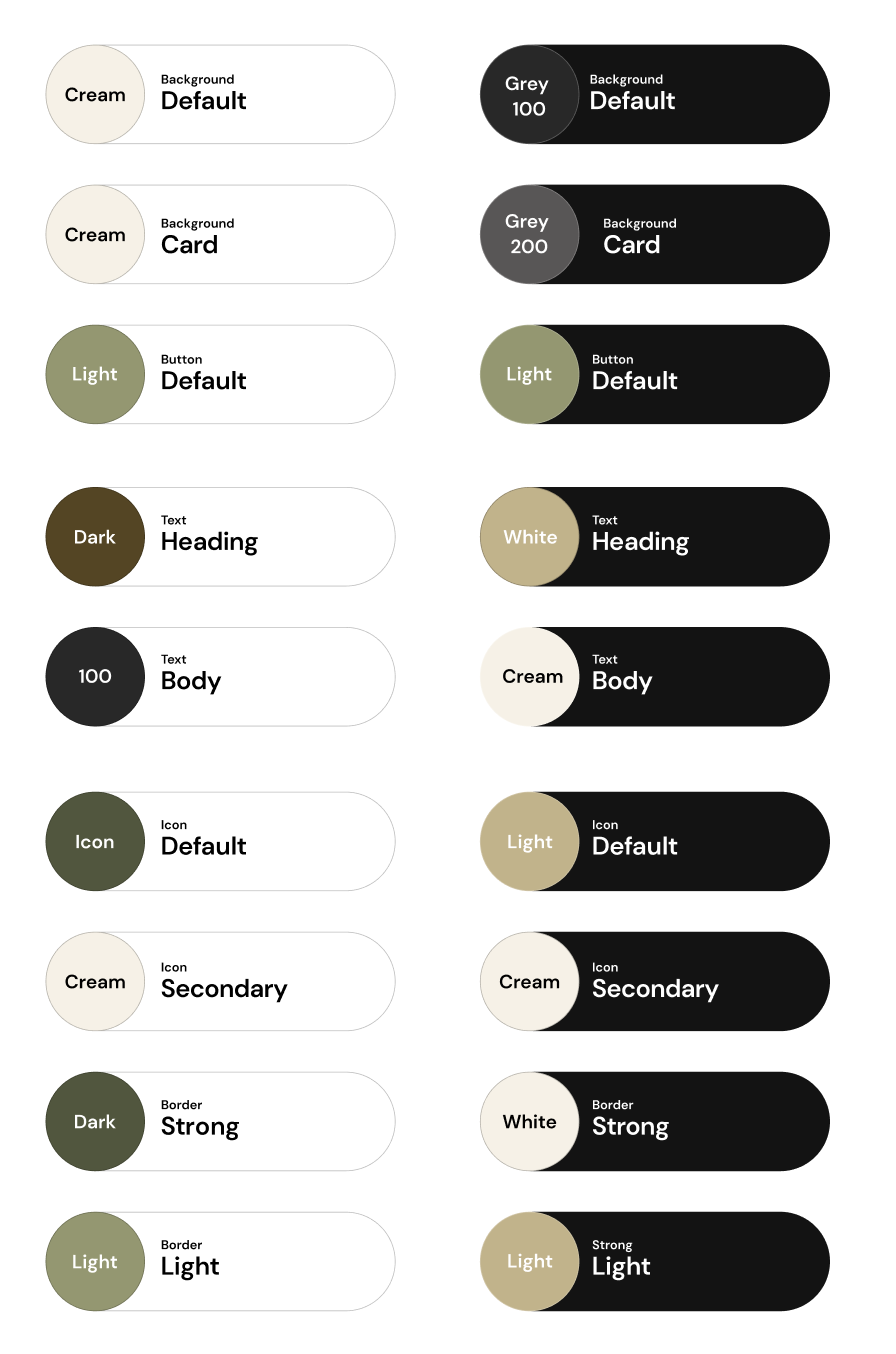
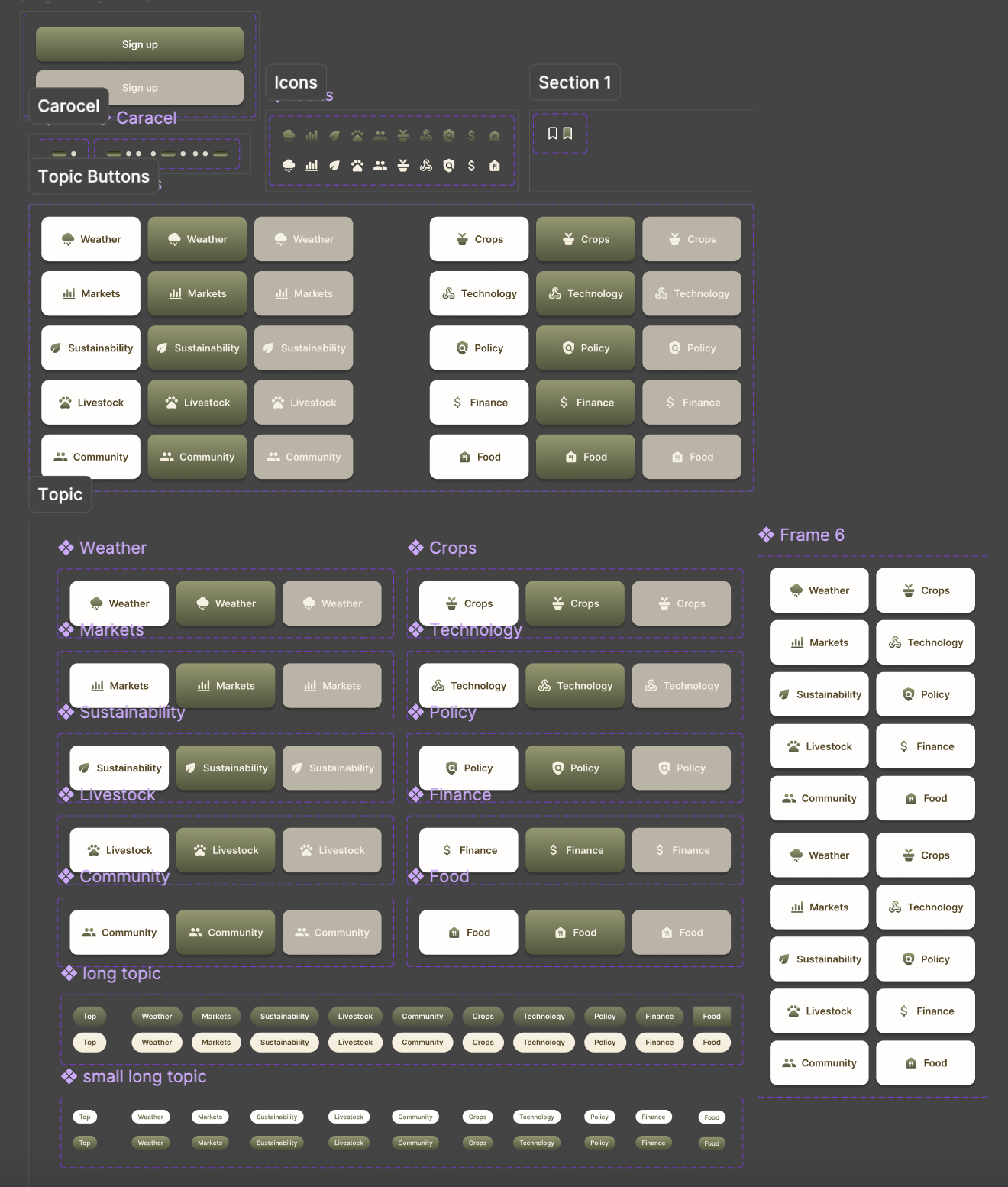
UI Kits
A UI kit was developed in Figma to ensure consistency across the app. It included a cohesive color palette of earth tones, clean typography, and reusable components such as buttons, cards, and navigation elements. This helped maintain a unified look and made the design process more efficient.
User Testing
User testing showed that the Farmline app was easy to navigate and users responded positively to its clean, earthy design and readability. However, some users had difficulty noticing the navigation menu and suggested improving the clarity of categories and headline hierarchy.
Reflection
Overall, the Farmline Magazine project was a valuable experience in designing a simple, user-friendly mobile app from concept to prototype. It helped me improve my skills in layout, visual hierarchy, and designing for a specific audience. Through user testing, I learned the importance of clear navigation and would refine the category system and hierarchy further in future iterations.